← All work
Case 03Zillow

Re-architecting sign-in for a housing super-app.

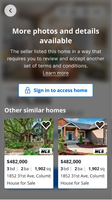
Zillow's sign-in experience needed a major upgrade to become a Housing Super App. At the time, it quietly hurt customers.

Role
Director of Design
Team
4 designers · 17 PMs · 50+ eng
Scope
Onboarding · Product Communications · Authentication · Information Architecture

The challenge

Zillow's unconventional sign-in helped in the short term.

Minimal friction captured a high volume of leads. The same shortcuts made the Housing Super App impossible - blocking customization, slowing product development, and threatening Zillow's high security standards. While the team roadmapped small improvements, I ran an independent audit and crafted a holistic experience strategy to ensure we targeted the highest impact improvements.

01
Not personalized
Zillow couldn't connect behavior and data to an identity. Customers engaged and gave us information; we treated them like strangers.
02
Data wasn't protected
The customer-data infrastructure couldn't protect what people shared.
03
Trust low, load high
Customers were asked to sign in repeatedly, sometimes twice in one session.
Where we were

Evaluating the current experience.

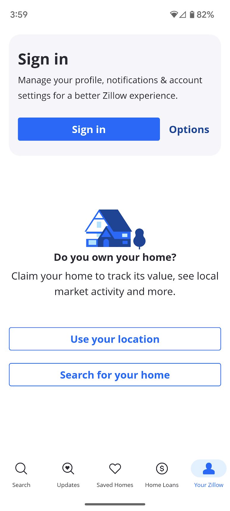
I audited every place sign-in was required, how customers were asked, and what we asked for. The picture: a system that grew one feature at a time.

21
entry points where sign-in was required
3
distinct sign-in patterns
5
fields to sign-in, inconsistently used
sometimes customers signed in twice (Shopping ≠ ZHL tokens)
21 places to sign in
21 entry pointsaudited & mapped
  1. 01Global navigation
  2. 02Tour a rental
  3. 03Save a search
  4. 04Tour to buy
  5. 05Save a home
  6. 06Contact an agent to buy
  7. 07Claim a home
  8. 08Ask a question about a rental
  9. 09Get new listings in email (save search)
  10. 10MISO seller
  11. 11Hide a home
  12. 12ZHL PreQual
  13. 13Apply to rent
  14. 14Full Page Auth
  15. 15Write a review
  16. 16ZRM top nav (resources, price, post a listing)
  17. 17View owner dashboard, correct facts, edit photos
  18. 18PA sign in
  19. 19ZRM list your properties
  20. 20PA join
  21. 21ZRM advertising
Three sign in patterns
Hidden sign-in gate
Customers acted on what they wanted and were blocked by a sign-in ask.
Hidden sign-in
Customers completed a form and were signed in without knowing.
Visible sign-in
Customers knew they had to sign in to get what they wanted.
Hidden sign-in gate
Hidden sign-in gate Blocked on intent
Hidden sign-in
Hidden sign-in Signed in via a form
Visible sign-in
Visible sign-in The honest version
Best practices

How sign-in was crafted by companies we admired.

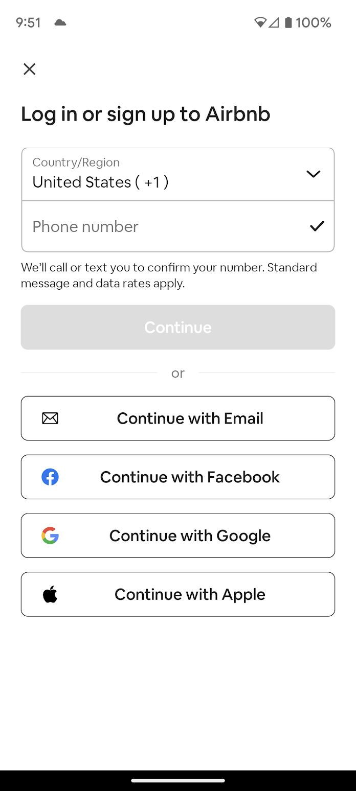
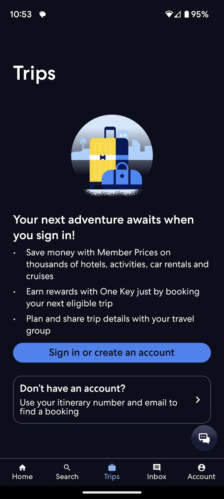
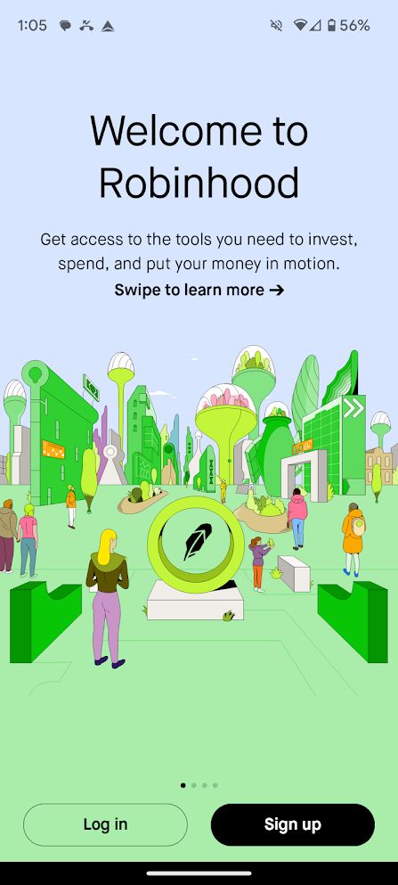
I studied browsing-first apps (Airbnb, Expedia) and transaction-first apps (Robinhood, Ally, CarMax). They behaved differently for a reason, and Zillow was both.

Airbnb: Optional at the start
Airbnb

Optional at the start

Let people in before forcing a decision.

Airbnb: Consistent fields & UI
Airbnb

Consistent fields & UI

Same ask, same interface, every time.

Airbnb: Streamline the next time
Airbnb

Streamline the next time

Use what you already know.

Expedia: Once you're in, you're in
Expedia

Once you're in, you're in

One identity across the app.

Expedia: Reflect customer intent
Expedia

Reflect customer intent

Match the moment and the risk.

Robinhood: Build trust when it's sensitive
Robinhood

Build trust when it's sensitive

More context as the stakes rise.

Zillow vs. best practice: the report card
Optional at the start
A sign-in at the start, but no way out.
B
Consistent information & UI
Different asks; sometimes signed people in unknowingly.
F
Streamline future sign-ins
Did leverage prior info to streamline form-fills.
A
Once you're in, you're in
Multiple sign-ins across Shopping and ZHL.
F
Reflect customer intent
Context provided inconsistently.
B
Build trust when sensitive
No trust-building when Movers might be financing or buying.
F
A recommendation

Acknowledge constraints and propose a path.

There was no single right answer until the business decided what it was optimizing for. So the recommendation was a sequence that de-risked the decision, not a finished screen.

01
Business model tension
Volume of unverified leads vs. quality of verified leads and secure transactions, and each added friction somewhere.
02
Organizational tension
One team wanted SMS OTP. Another wanted Email OTP. Prioritizing one taxed the other.
03
Tech constraints
Auth0 / multi-IDP migration forced modals that could add friction.
04
Missing insights
Sign-in events hadn't been tracked consistently, or at all.
Recommended next steps
01
Agree and align on Assurance Levels
02
Agree on a holistic design recommendation
03
Mitigate risk through experimentation
04
Measure potential impact
05
Agree on the winning sign-in strategy
06
Agree on a roll-out plan
Code red · drop everything

In the meantime, execs suddenly uncovered an urgent (and confidential) business need.

Creating momentum

Lead with strategy. Be the player-coach. Be the glue.

With no PM DRI, thin design resources, and sixteen engineering teams in play, the job was to manufacture alignment, and to keep craft high while doing it.

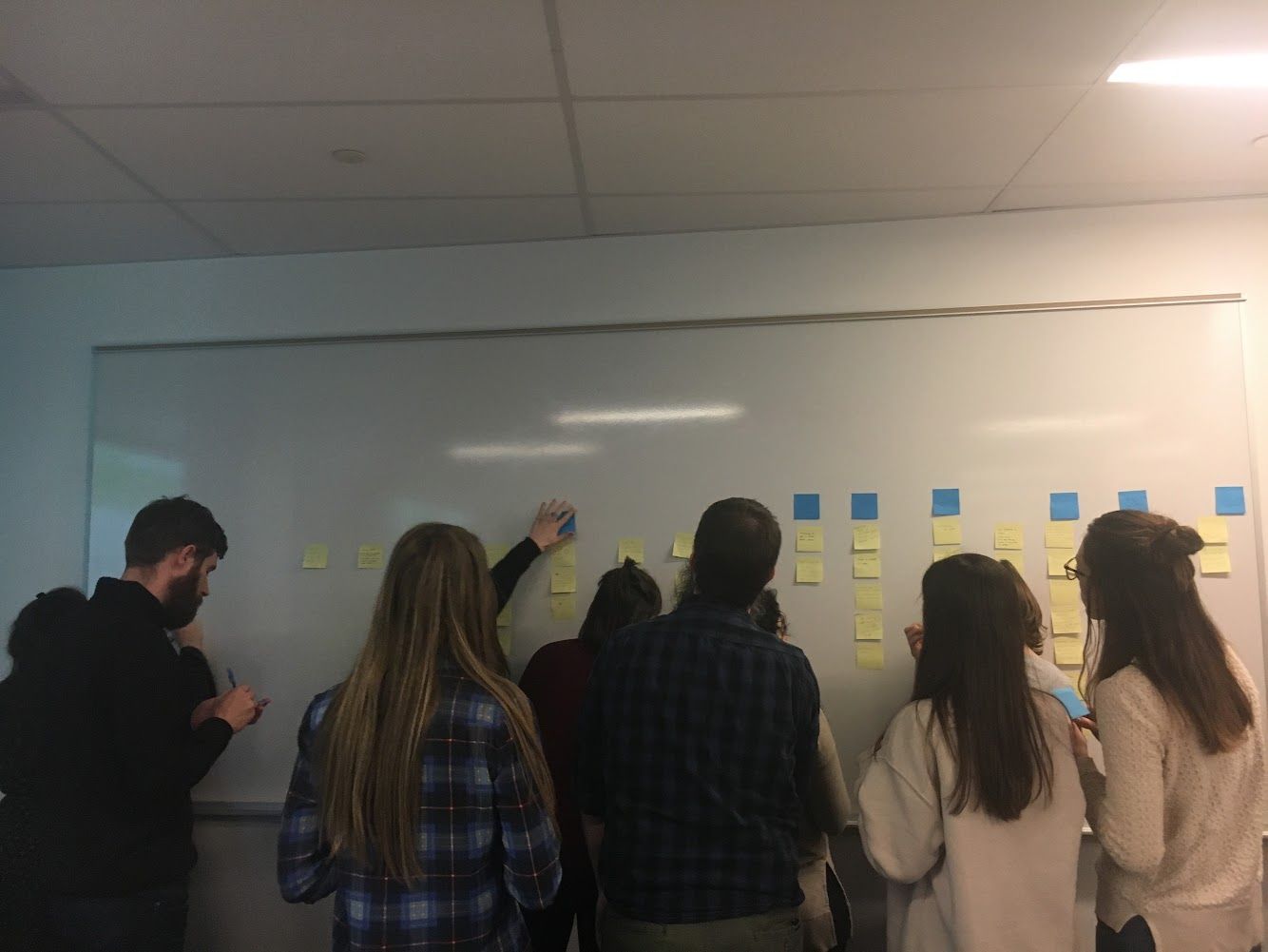
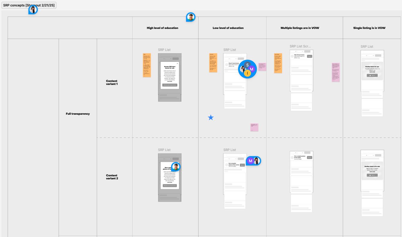
I wrote a one page product document, met with my junior designer daily to ensure high craft, ran cross functional design workshops to align on a concept, and teed up customer research to lead through design and create clarity for the business.

01
No PM DRI
Lead with a design strategy.
02
Inadequate design resources
Be a player-coach who designs alongside the team.
03
A 16-team cross-company effort
Be the glue. Surface the gaps, including in engineering.
Surfacing disconnects
Surfacing disconnects Naming the gaps, in the open.
Cross-functional brainstorm
Cross-functional brainstorm Themes with PM, Content Design, Design, and Research
Creating divergent concepts
Creating divergent concepts So research had something real to test.
A one-page product doc
A one-page product doc Customer problem, business problem, personas, scenarios.
Teed up research & prototypes
Teed up research & prototypes Solving for customers and actionable research outcomes.
Sharing in the open
Sharing in the open Eng looped in, Figma open for comment.

Great work is never done. The story (probably) lives on to this day.

Case 01 · hands-on, in flight
Vanta →
Next case